1. No Editable Type Layer Left
Flattened graphics store pixels rather than live font objects. Clone-stamping over words on gradients, wood grain, or chalkboard textures often leaves visible smudges.
Fix a typo, update a headline, or translate a product label while matching the original font and background. Try one watermark-free edit free at 1K or 1.5K with no sign-up (up to 20 credits per network), or sign in for 20 bonus credits.
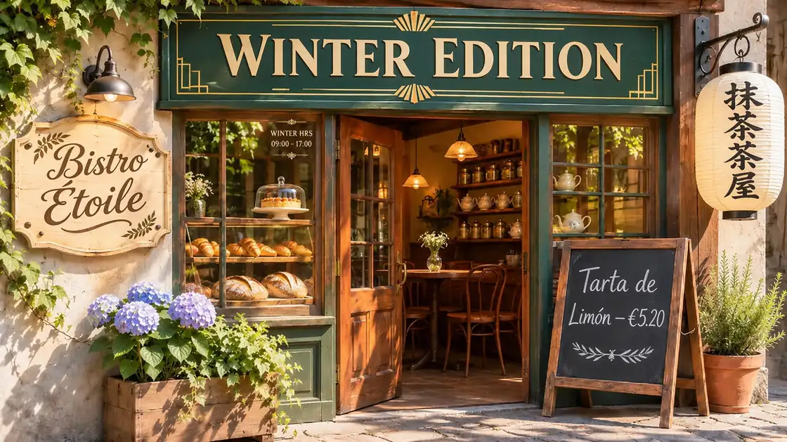 OriginalEdited
Auto-sweeping comparison across 5 type styles (serif, swash cursive, small window glass text, Kanji, chalk) — hover or drag to inspect
Upload a JPG, PNG, or WebP up to 10 MB (30 MB at 4K). Leave Aspect Ratio on Auto to keep your original framing.
OriginalEditedAuto-sweeping comparison across 5 type styles (serif, swash cursive, small window glass text, Kanji, chalk) — hover or drag to inspect
EaseGen's AI Image Text Editor replaces words inside flattened JPG, PNG, and WebP images while matching the surrounding lettering, lighting, and surface texture. Upload one image up to 10 MB (30 MB at 4K) in Image to Image, export clean 1K, 1.5K, 2K, or 4K results, and test a 1K or 1.5K edit online without signing up.
Unlike text-box overlay tools that erase old words into a blurred patch and paste a flat system font on top, visual redrawing adapts stroke weight, letter spacing, perspective angle, and shadows directly inside the scene. You keep control over exact spelling, line breaks, and what stays untouched—from logos and product photography to small fine print.
Once a poster, menu, or screenshot is exported as a JPG or PNG, text becomes flat pixels fused into the background. Standard shortcuts leave obvious seams unless the surrounding grain, angle, and lettering style are reconstructed together.
Flattened graphics store pixels rather than live font objects. Clone-stamping over words on gradients, wood grain, or chalkboard textures often leaves visible smudges.
Automated grab-text overlays fall back to generic system fonts whenever your original uses custom display lettering, hand-painted signage, or distressed ink.
Typing a sharp vector layer over a compressed JPEG looks fake immediately because it lacks the subtle anti-aliasing, sensor noise, and shadow falloff of the original shot.
Flat 2D text boxes cannot follow cylindrical bottle labels, folded fabric banners, or storefront signs photographed at an angle without manual mesh warping.
Uses nearby letters in your uploaded image as a visual reference for stroke weight, serif or sans shape, color splits, and baseline rhythm.
Fits replacement wording onto curved bottle labels, chalkboard grain, folded banners, and angled boxes without flattening the background texture.
Quotes and location anchors isolate the exact phrase you want changed so logos, faces, product shots, and small print stay consistent.
Keep Auto aspect ratio to lock your original framing and download clean JPG or PNG files at 1K, 1.5K, 2K, or 4K resolution.
Drop in the sharpest JPG, PNG, or WebP copy you have (up to 10 MB at 1K–2K, or 30 MB at 4K). Keep Aspect Ratio set to Auto so your original framing stays locked.
Place both phrases in quotation marks and name where the line sits, such as “on the top headline, replace LIGHT THAT THINKS with LIGHT THAT INSPIRES.”
Call out color splits, curved surfaces, or line-wrapping rules if your replacement is longer, then pick 1K, 1.5K, 2K, or 4K output.
Click Replace Text, zoom in to check spelling, accents, and nearby small print against your source image, and download your finished file.
Click Use Prompt to load any template into the editor above, then swap in the quoted words and location from your own image.
On the Luma Arc lamp poster, replace the headline “LIGHT THAT THINKS” with “LIGHT THAT INSPIRES”. Keep the two-line layout, white first line, and gold second line. Match the bold sans-serif letter height and tracking, and preserve the lamp photograph, launch date, and small feature captions.
Why this works: Quoting the exact two-word target and naming the white/gold color split stops the editor from blending both lines into one color or shifting the subheadline below.


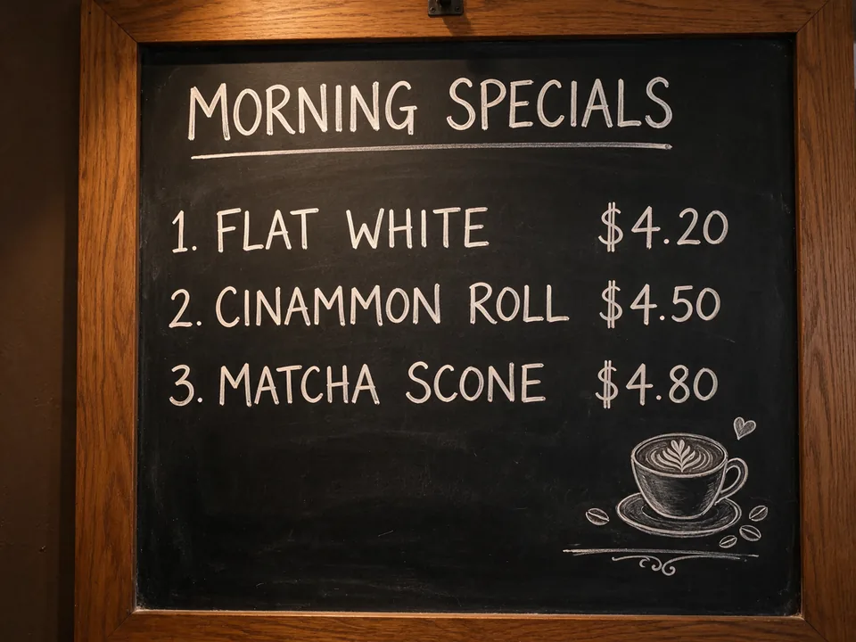
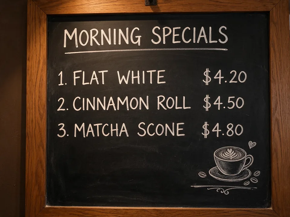
On the second line of the cafe specials menu, change “CINAMMON ROLL” to “CINNAMON ROLL”. Match the hand-drawn chalk lettering weight and warm off-white tone, keep the price aligned in the right column, and preserve the dark slate chalkboard texture.
Why this works: Naming the row number, chalk stroke texture, and price column alignment prevents neighbouring menu items and prices from drifting.
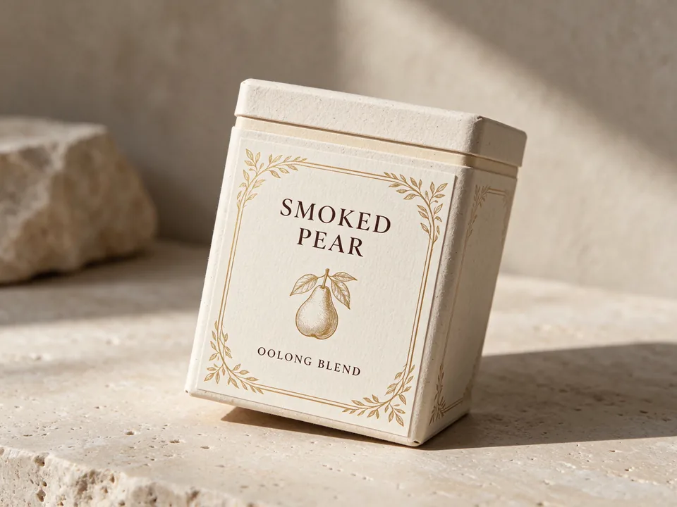
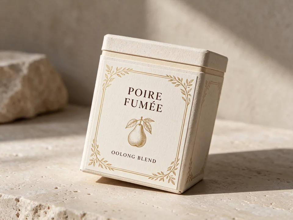
On the front label of the tilted tea carton, replace “SMOKED PEAR” with “POIRE FUMÉE”. Keep the acute accent on the É, follow the box's perspective angle, match the serif cap height, and retain the printed border and botanical illustration.
Why this works: Calling out the accented character É and the box's perspective angle helps keep curved or tilted packaging legible without flattening the surface.
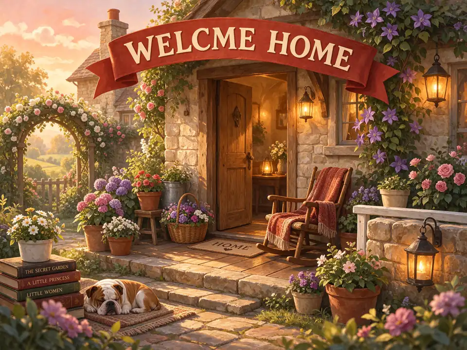
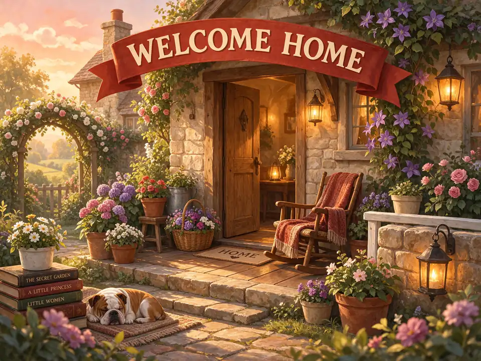
On the curved red ribbon banner at the top of the illustration, replace “WELCME HOME” with “WELCOME HOME”. Follow the arched ribbon baseline using the same cream block lettering and drop shadow, and keep the banner folds and characters unchanged.
Why this works: Fixing one misspelled word in an existing AI graphic saves rerolling the whole composition while keeping arched lettering aligned with the ribbon folds.
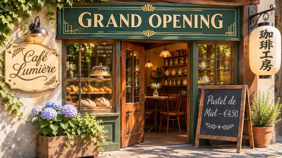
Tested on 2026-11-20 using one 16:9 storefront photo across five lettering challenges: Art-Deco serif capitals, hand-painted swash cursive script, vertical Japanese brush Kanji, slate chalk, and delicate small painted window hours. Every model ran the exact same five-edit prompt at 1K on a single pass with zero retries.
Original Source Photo (1672 × 941 · 16:9)
Identical 5-Target Prompt Sent to All 4 Models
Edit this storefront photograph while keeping the building, lighting, wood grain, bakery pastries, paper lantern texture, and slate chalkboard identical. Make exactly five text replacements, matching each sign’s original font style, color, material texture, and perspective: 1. On the top green fascia sign, replace "GRAND OPENING" with "WINTER EDITION" in the exact same gold-and-cream Art Deco serif capitals. 2. On the left cream wooden plaque, replace the flowing swash cursive script "Café Lumière" with "Bistro Étoile" in the exact same dark brown hand-painted calligraphy style, matching the arched swash flourish underline, acute accent on É, and olive sprig borders. 3. On the hanging Japanese paper lantern, replace the black brush-calligraphy characters "珈琲工房" with "抹茶茶屋" in the same vertical black ink brush style. 4. On the dark slate chalkboard, replace "Pastel de Miel — €4.50" with "Tarta de Limón — €5.20" in the same hand-lettered white chalk style, keeping the acute accent on ó. 5. In the small painted glass lettering on the bakery display window pane, replace "OPEN DAILY" / "08:00 - 18:00" with "WINTER HRS" / "09:00 - 17:00" at the same delicate small scale and cream-gold style.
Fastest run (21 s) and strongest overall font match. Reproduced the thick-thin swash weight and curved flourish under Bistro Étoile, natural lantern brush ink, and razor-sharp small window text with zero stray punctuation.
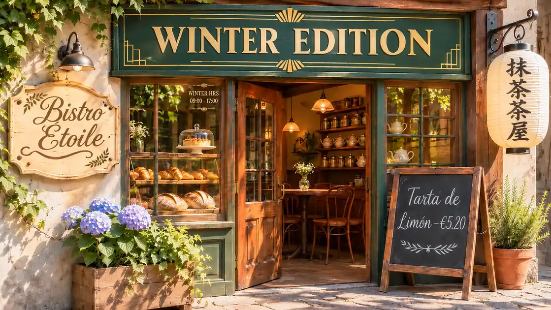
Sharpest 1K resolution (1672 × 941) with native Auto framing. All five languages and tiny window numbers read cleanly, though Bistro Étoile strokes thinned slightly and small window copy added an extra period (WINTER HRS.).
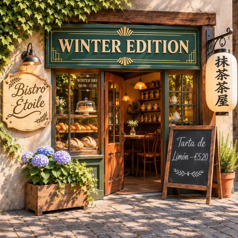
Matched Bistro Étoile swash calligraphy and tiny window hours well inside the center frame, but passing Auto forced a 1:1 square crop (1024 × 1024) again instead of keeping 16:9.
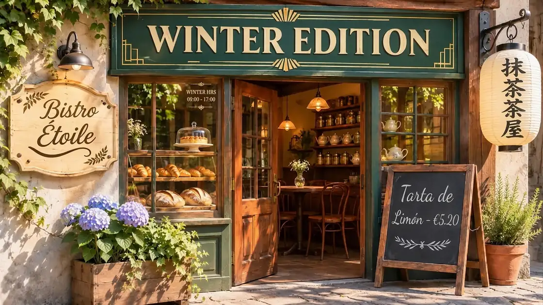
Preserved 16:9 framing and readable small window text, but Bistro Étoile flattened into a thinner monoline italic look that lost the original thick downstroke contrast, and lantern strokes looked stiffer.
| Check | Seedream 5.5 | GPT Image 2.5 Sunburst | GPT Image 2.6 Sunburst | Nano Banana 2.1 |
|---|---|---|---|---|
| English Art-Deco serif (“GRAND OPENING” → “WINTER EDITION”) | Yes | Yes | Yes | Yes |
| French swash cursive + flourish (“Café Lumière” → “Bistro Étoile”) | Yes (exact weight) | Yes (slightly thinner) | Yes | Weak (thin monoline) |
| Small painted window lettering (“OPEN DAILY / 08:00 - 18:00” → “WINTER HRS / 09:00 - 17:00”) | Yes (sharp) | Minor period (HRS.) | Yes | Yes |
| Japanese brush Kanji (“珈琲工房” → “抹茶茶屋”) | Yes (natural ink) | Yes (crisp brush) | Yes | Mostly (stiffer) |
| Spanish chalk + accent (“Pastel de Miel — €4.50” → “Tarta de Limón — €5.20”) | Yes | Yes | Yes | Yes |
| Kept 16:9 framing & fits guest preview (≤ 20 credits) | Yes (16:9 · 16 credits) | Yes (16:9 · 13 credits) | No (1:1 crop · 31 credits) | Yes (16:9 · 8 credits) |
Swash script calligraphy and tiny glass lettering exposed clear differences: Seedream 5.5 finished fastest (21 s) and preserved both the thick-thin curved flourish on Bistro Étoile and razor-sharp small hours text without extra punctuation, while GPT Image 2.5 Sunburst delivered the sharpest 1672 × 941 native-Auto output for 4K upscaling.
Asking an editor to simply "fix the text" often alters adjacent lines or crowds the layout. Pair exact quotes with position and spacing cues.
Weak
Fix the misspelled coffee item on this menu photo.
Better
On the third line under Hot Drinks, replace “EXPRESO” with “ESPRESSO”. Match the condensed white lettering, keep the $3.50 price aligned, and leave all other lines unchanged.
Weak
Change Summer Sale to Summer Clearance Event This Weekend Only.
Better
Replace “SUMMER SALE” in the center badge with “SUMMER CLEARANCE”. Stack the two words on separate lines, keep the left edge aligned, and scale slightly down so no letter touches the gold border.
Weak
Change the bottle text from Peach to Vanilla.
Better
On the front curved label of the amber bottle, replace “PEACH” with “VANILLA”. Follow the cylinder's curve, match the matte cream paper grain and dark serif ink, and keep the studio reflections intact.
If a headline crowds the border, edits the wrong line, or looks slightly soft around the edges, adjust one of these three details.
Add a clear layout rule such as “keep the left margin aligned and wrap after the second word” or slightly shorten the replacement phrase so glyphs retain breathing room.
Quote two neighboring words from the line above or anchor by visual landmark—for example, “inside the red badge at top right”—and change one occurrence per pass.
Upload the highest-resolution original instead of a compressed screenshot, switch output resolution to 2K or 4K for dense flyers, and list nearby dates or captions to keep untouched.
Checked against public product pages and pricing on 2026-11-20. Choose based on whether you need fast in-place visual blending or layered vector control.
Update dates, venue names, or campaign headlines on exported JPG or PNG posters when the original layered design file is missing.
Fix typos or revise seasonal item names and prices on chalkboards, tabletop menus, and window graphics while preserving board texture.
Swap flavor names, taglines, or short callouts into another language on angled cartons and bottles without losing studio reflections.
Correct misspelled words on banners, book covers, and illustrated graphics in a targeted pass instead of regenerating the entire scene.
Adapt promo headlines, discount percentages, or regional copy across square and vertical ad visuals while keeping product photography fixed.
Clean up outdated labels, button copy, or headline typos inside flattened screen captures and presentation graphics.
Create AI images online for free with no sign up from text prompts or reference images. Make product visuals, posters, ads, thumbnails, and social graphics with EaseGen.
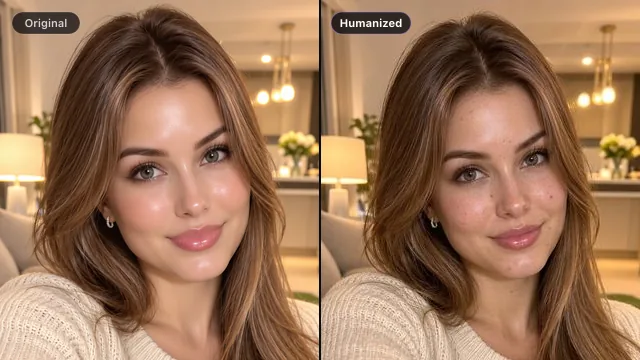
Remove plastic skin and over-processed AI glow so generated photos look naturally shot.
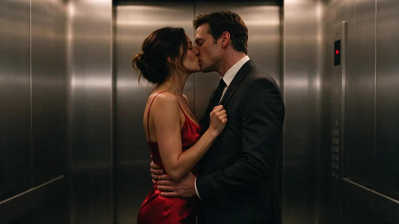
Create bold portraits, daring fashion, and dark fantasy with almost no creative restrictions.
Turn your ideas into images and videos in one creative workspace.